Shifting the conversation from B2B to B2Human
Client
VMware
Role
UX Strategy
UI Design
Content Architecture
Awards
AC&E Finalist – Best UX
AMY Finalist – Customer Acquisition
Tangrams Finalist – Best Digital Strategy | Website
Shifting the conversation from
B2B to B2Human
Global enterprise software company, VMware, developed an innovative arm to launch its new cloud-based solution. They needed to educate different audiences about the solution with varying levels of technical information.
The challenge
How to convey the right message to the Developer, IT Director and CIO – and have them make a unanimous decision on a long-term platform choice?
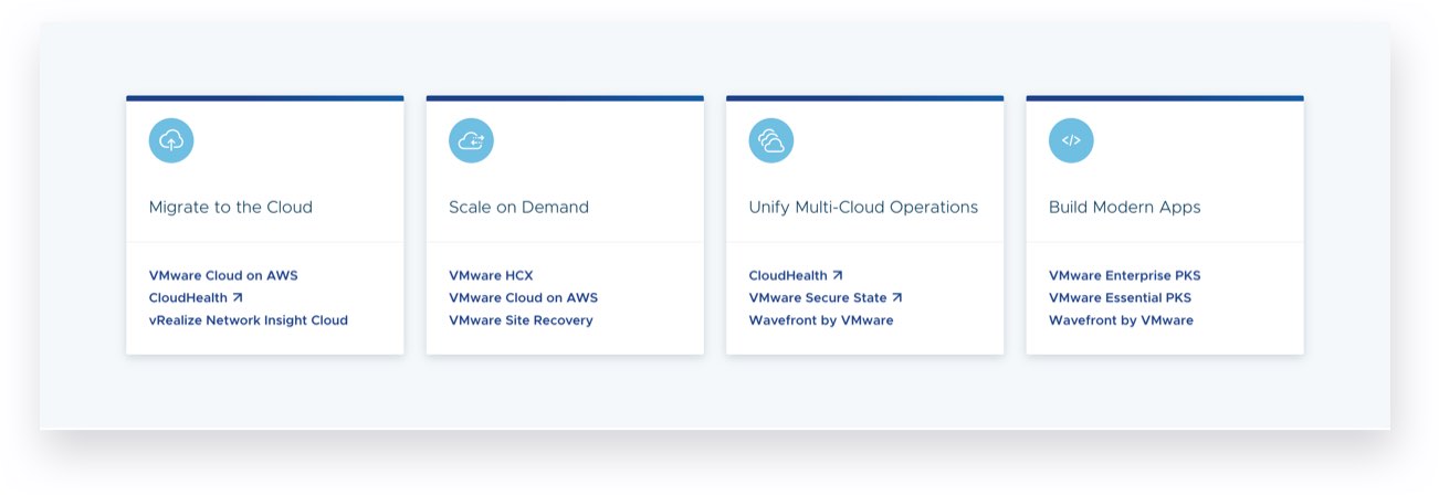
VMware tasked us to develop a web platform that:
1.
Raised awareness of their expanding portfolio of cloud products
2.
Increased online form conversions
3.
Increased qualified sales leads.
A deep dive into
audience behaviour
Rather than segment audiences into roles such as DevOps or C-Suite, we created behavioural personas – allowing us to classify the different types of actions people take on the site and use these insights to inform the content they might need.
Informed by our interviews, we identified three behavioural personas:
Divers: People who KNOW what they’re looking for.
Swimmers: People who MIGHT KNOW what they’re looking for.
Waders: People who DON’T KNOW what they’re looking for.
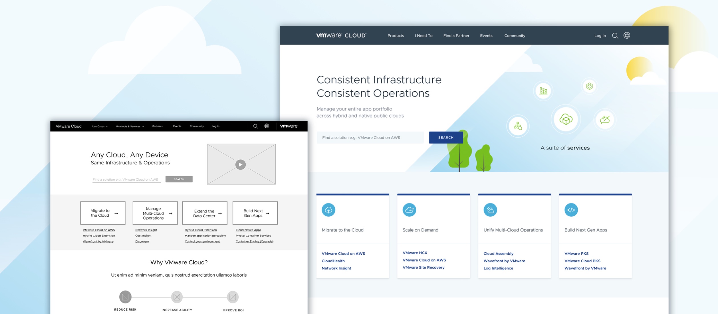
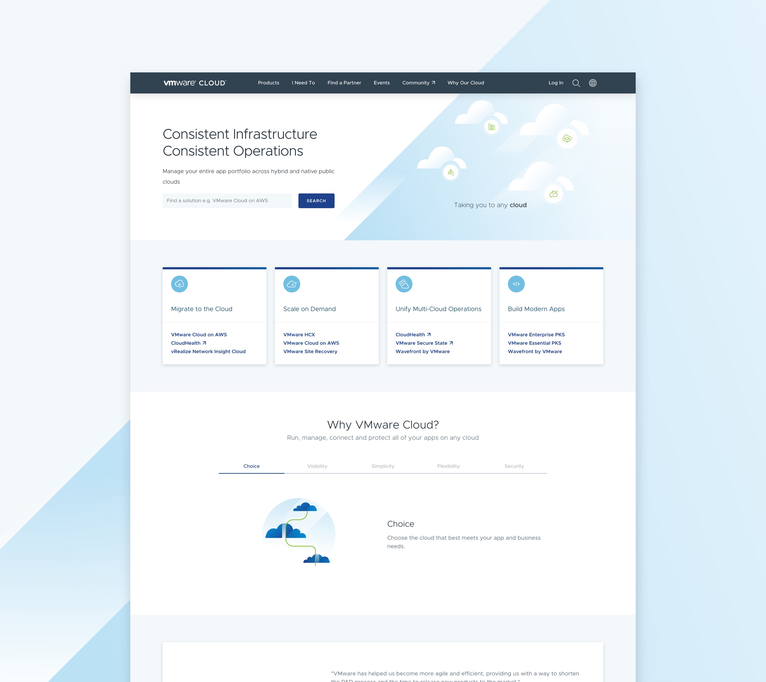
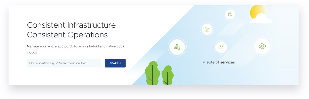
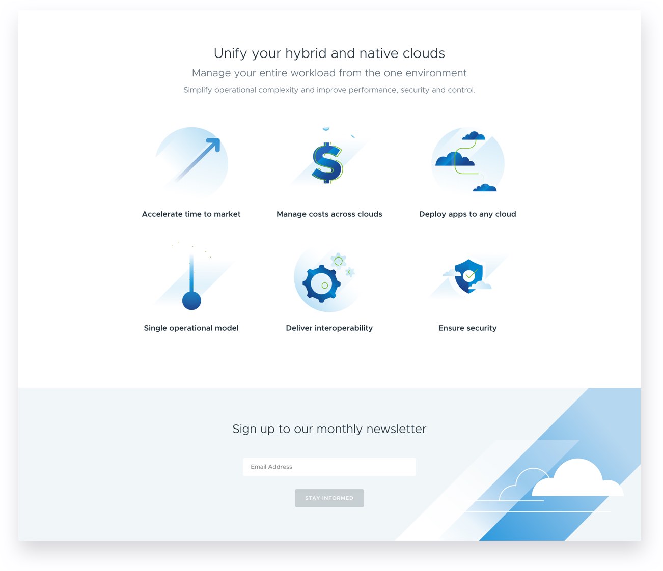
Optimising the UX
Our platform had to provide a framework for decision-making, storytelling, stakeholder alignment and categorisation of information on the site.
With our audience’s behaviours in mind, we created a journey for each group, with their actions on site determining their path.
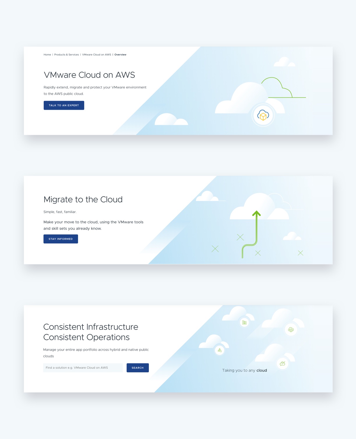
Divers
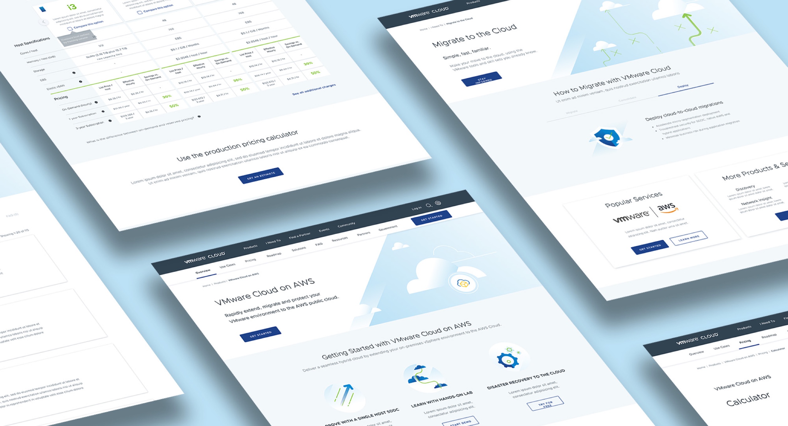
For people who know we prioritized search, SEO and CTAs so they could get to their destination quickly.
Swimmers
For people who might know, we applied guided search, placed clickable links in their path, classified information into buckets and suggested topics. As they clicked, they self-selected their way.
Waders
For people who don’t know, we put explanatory information lower down, so that as they scrolled, they learned more. We added interactive animations, and encouraged sign-ups to the newsletter and sharing of infographics.
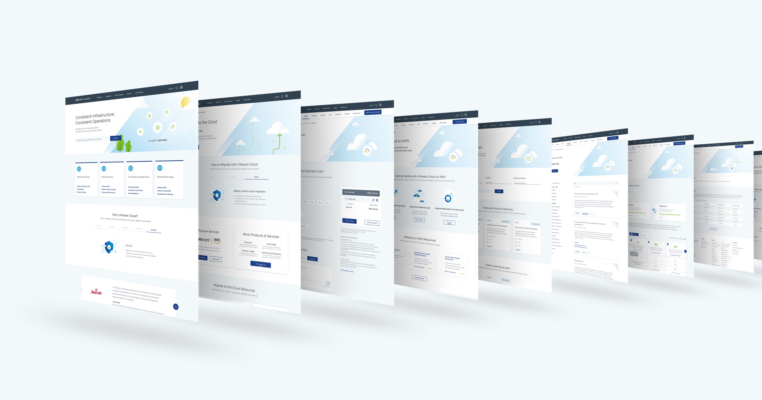
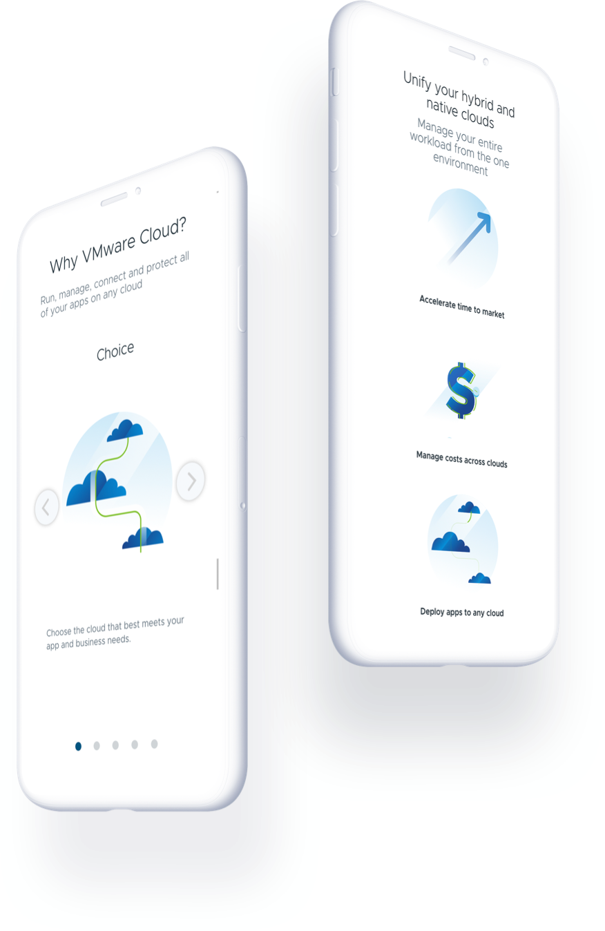
With the client’s development
house, we delivered:
35 custom interactive
animations and icons

1 unique set of brand visuals
and tone of voice
100+ pages of content – both
written and designed
Results and Impact
2460%increase in Form Completion Rate
121%increase Web MQL Rate
34%increase in individual product form completion rate
“
The makeup of traffic remained much the same before and after site launch, therefore, we can conclude that this strong performance is due to the improved quality of the site rather than improved quality of traffic.
BANCROFT DIGITAL
Independent analysts
Awards
AC&E
Finalist – Best UX
AMY
Finalist – Customer Acquisition
Tangrams
Finalist – Best Digital Strategy | Website